Harry Beck was the original designer of what most cities these days use for transit maps. He first produced a map of the London underground back in the 1930s after realising that people weren’t too concerned about the physical geographic location of a station, but rather, their relationship to each other on any given (inter)connecting line. As a result, the geographical map style was replaced by the Beck map, and although it has seen many changes over the years, it is a derivative of this map that most cities use today.
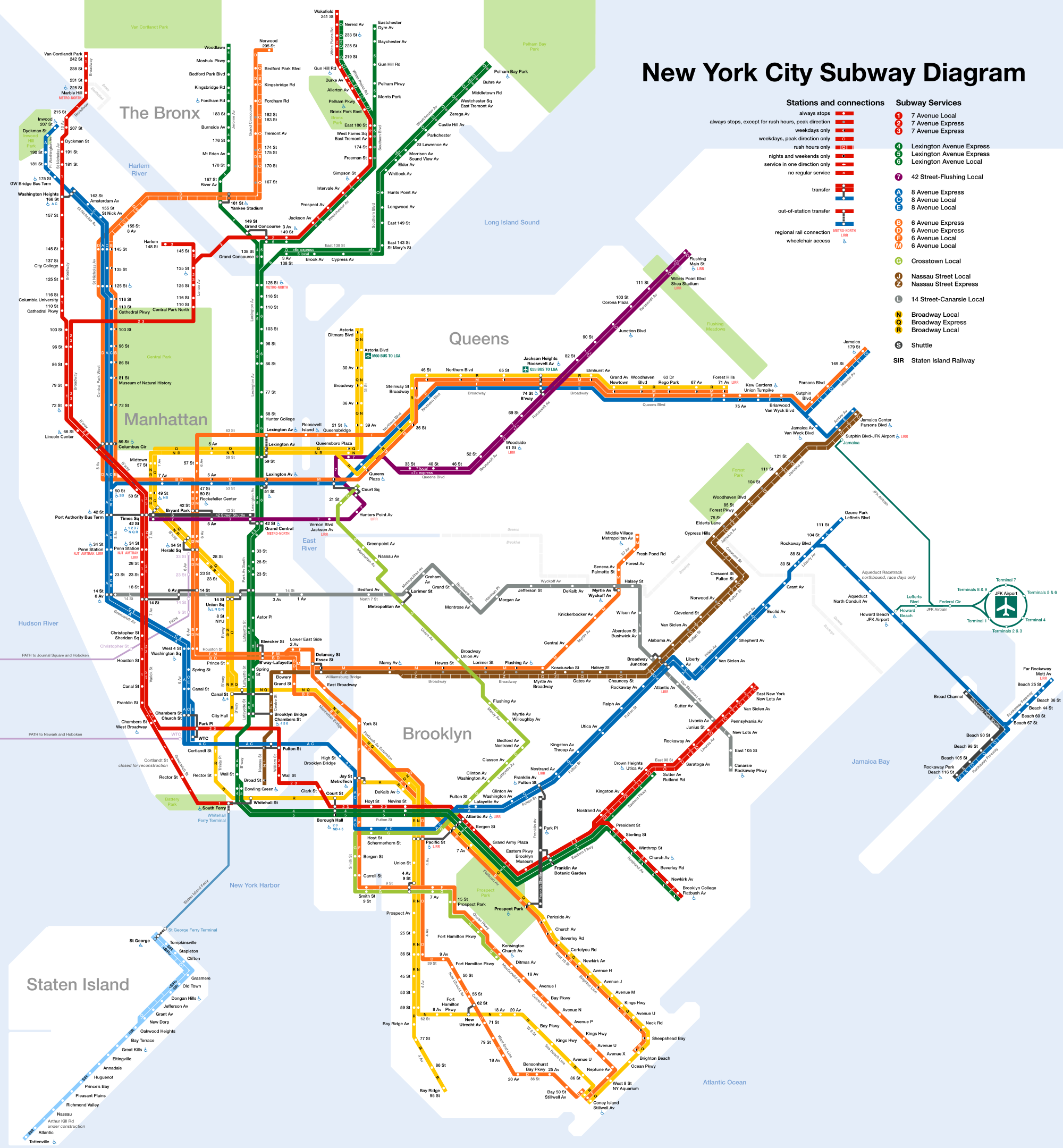
NYC 
1933 London 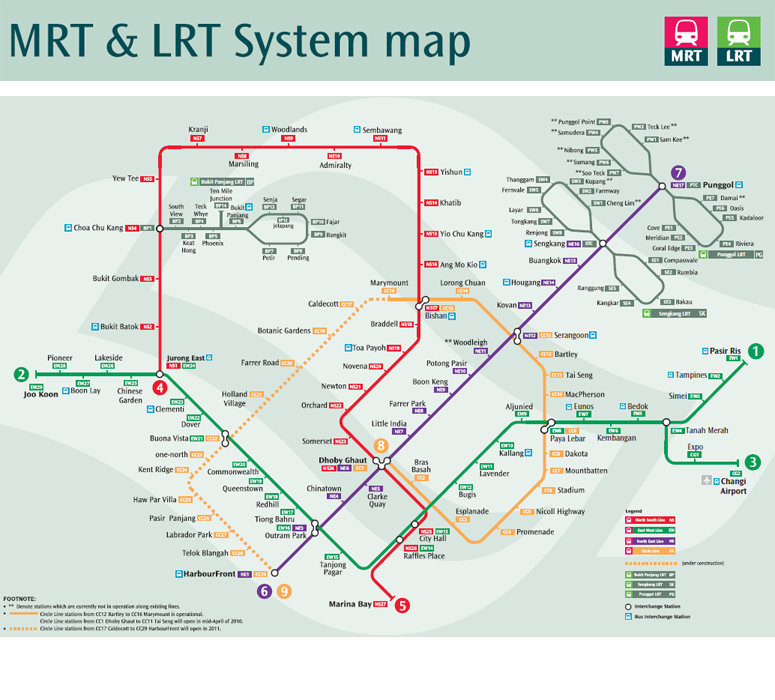
Singapore 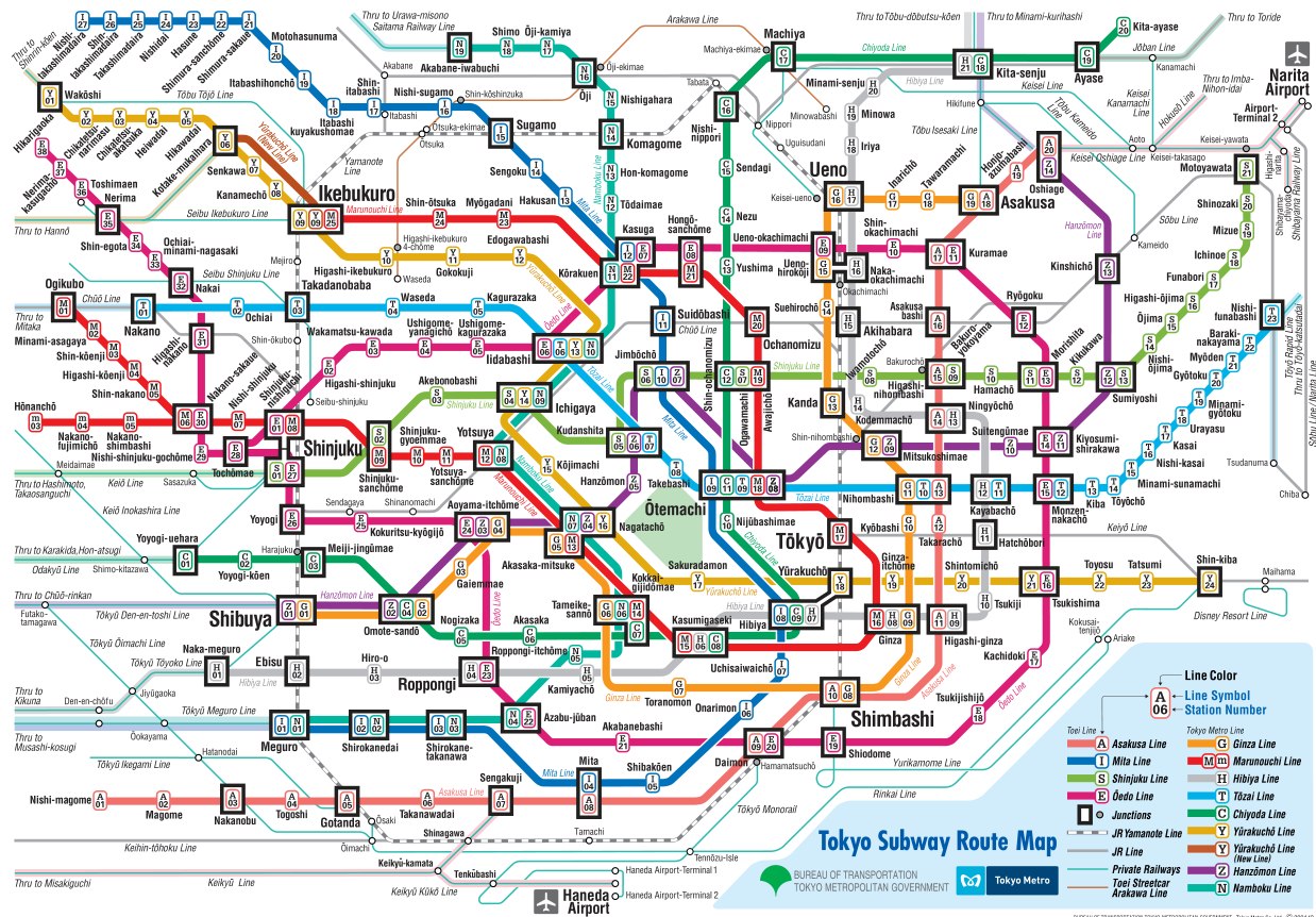
Tokyo 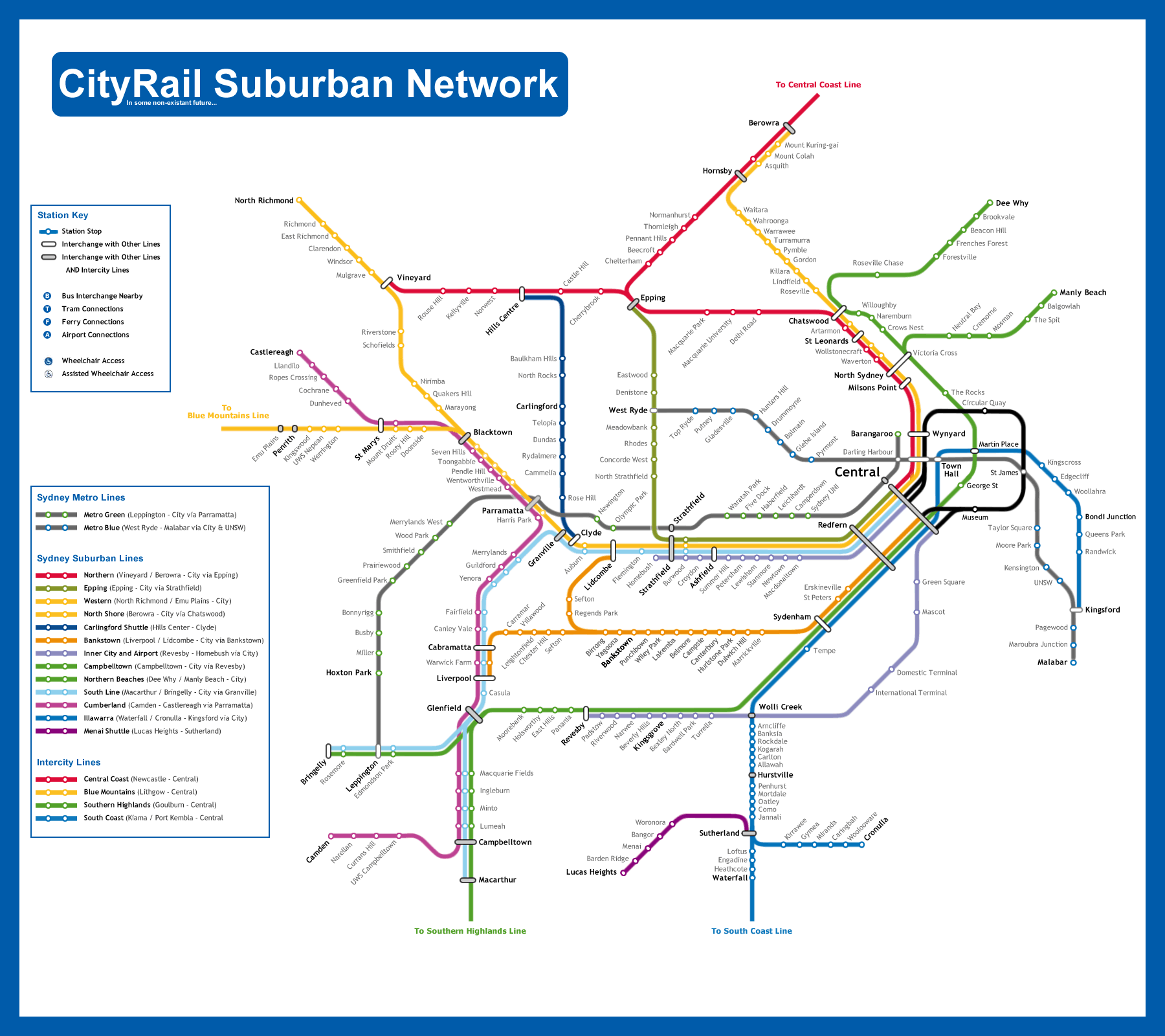
Sydney 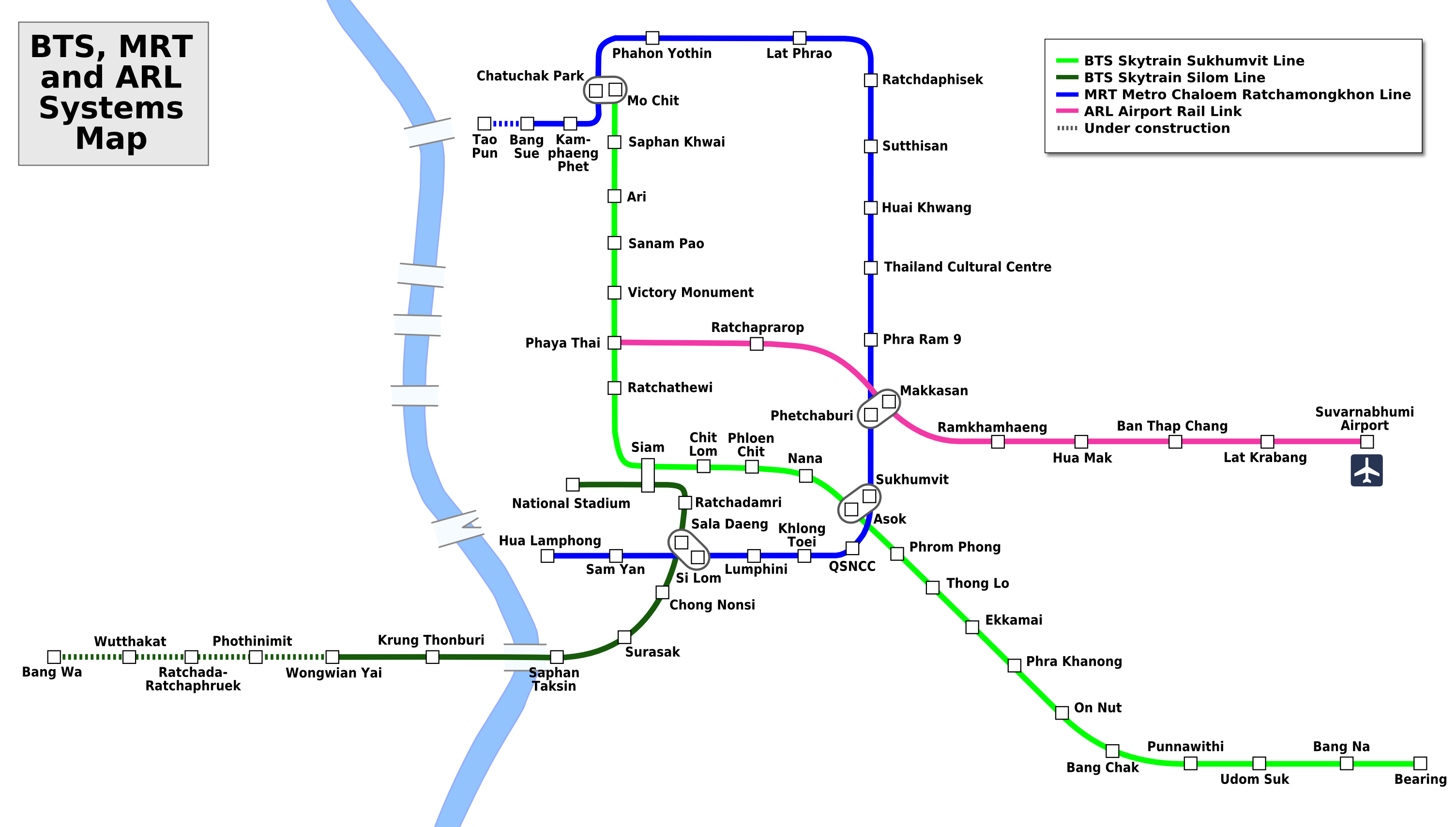
Bangkok
I do love these maps. They’re simply, unconcerned with geography and (generally) physical landmarks (exceptions usually being large bodies of water). They are not to scale, and they don’t need to be.
I’ve dug around the web and found these. First is the original (well, the oldest I could find) 1933 map of the London Tube, by Beck. Then I have the Sydney CityRail system, the Singapore MRT and LRT, the Bangkok BTS (because I am familiar with all these lines).
My first experience outside of Australia was with the Singapore system and then later Tokyo – which although appears very confusing, is a lot easier to use than it appears. After using the trains in Tokyo for just a day or two, they were surprisingly simple to navigate…. except for one small problem. Several suburbs/districts have several stations with the same name! now THAT get’s confusing!
I rounded off the six (I wanted an even number) with New York. Why? For no particular reason.