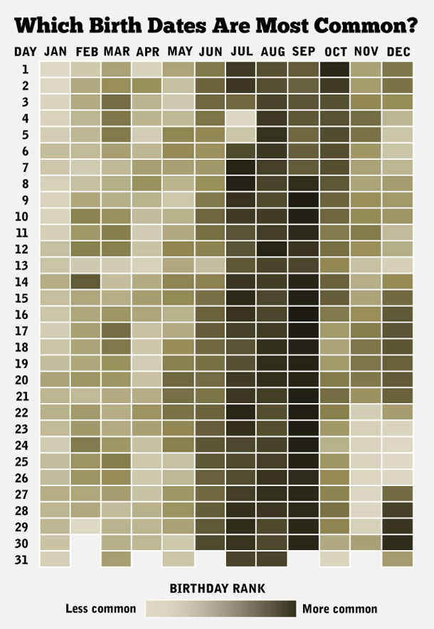
I’m currently analysing some data that includes birth dates. If the persons birthday isn’t known, there is a flag which indicates it’s an estimate, and the day and month are set to one. New Year’s Day.
Obviously the dataset indicates there are a lot of people born on the first of the first, and I’m trying to work out how many people have been labelled as having New Year’s day as a birthday and been incorrectly entered as an actual date. As a result, I did a Google search and came up with the attached birth date heat map. At first impression you may think that the data means that far fewer people are born around the beginning and end of the year, but that is in fact not what the image shows.
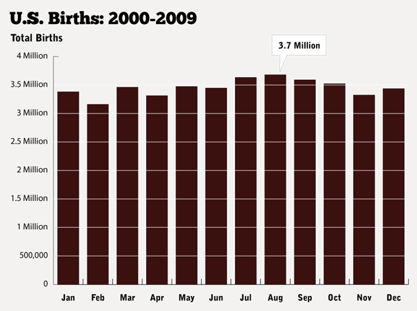
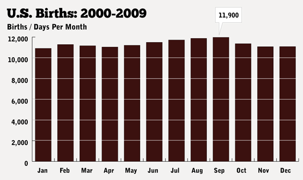
Matt Stiles posted about both the birth date heat map itself as well as an interpretation of it based on research data he obtained from the Centers for Disease Control and Prevention (CDC) National Vital Statistics Reports
sources:
New York Times Post: How Common Is Your Birthday?
Matt Stiles: How common is your birthday
Matt Stiles: How common is your birthday pt2