I’ve been waiting for this theme for a while. Installed it moments before WordPress 4.4 moved from RC to final.
1. Borders
The first thing I found I didn’t like was the border around the outside. It had to go.
Pop into your favourite CSS Plugin manager and change/add these two rules:
body {
  background-color: inherit;
}

#page.site {
  margin: 0px;
}
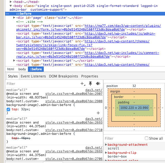
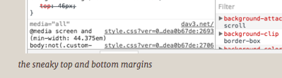
Discovering how to remove it was a two step process. Removing the margin from #page.site didn’t remove the entire border, it only removed the left and right side. Which surprised me at first and it took some digging but there’s a ::before snuck in there which manages the top and bottom borders.
To easily remove it, I just removed the colour of them, hence the inherit.
Digging around trying to find the top and bottom, I was forced to look at them for a few page reviews, and once they were gone I realised that I liked them. So I then removed the background-color style and brought them back. :)
2. Caption alignment
I don’t know why WordPress has a predilection for choosing to align captions to the left, I much prefer them to be centred. To me, it should be about a bit of symmetry. So, looking at the image above, it first looked like this:
I’m sorry, that just won’t do.
A quick and dirty fix is to include a text-align: center, like this:
.wp-caption-text {
  text-align: center;
}
3. Green & Amber Screens for <pre>
I’ve been using computers for so long that my first computers used green and amber screens. I remember the old green and amber CRTs we use to have. I actually had an amber one, I liked it, but most people didn’t.
So in doing this post and doing the borders section, I did one of my first usual edits, and that was to turn the <pre> style into something that resembled a green screen. But then as a joke, I made it amber, and find that with this colour scheme, I am preferring it. SO I think it’s here to stay. Regarding the <pre> style, This is what I came up with:
pre {
  background-color: #010;
  color: #3c3;
  font-family: "Courier New", monospace;
  overflow: auto;
  word-wrap: normal;
  white-space: pre;
}